Using Colors:
Part one: What color is and what colors things really are:
Color is something that came to me as an entirely new concept, all at once, without any way to start going about it other than to just start experimenting. I started off being pretty horrible at it, but I think each year I get a little better. Along the way I learn things about what I'm doing and why I'm doing it, so here are the things I've learned.
First, color gives a picture a sort of interest to it in a way that nothing else will. Any image can be in greyscale or black and white, but color adds certain things for it like mood and emotion. This doesn't mean that all things should be in color, but there are some things which are definitely enhanced and made better by color. For instance, this line work that I scanned in and then rendered in purple:


When first starting off with color, it's helpful to realize how much of it is everywhere. A tree, for instance, is not just green on top and brown on the bottom, but the green shines white and yellow in the sunlight, and the reflected greens fall down upon the bark, which is usually more grey than it is brown, with streaks of red and black. All things are filled with many colors like this.. Like right now, my desk is brown, so when I look at the wall behind it, the shadows are sorta brown too.. And a little yellowish, because of my offwhite lamp... And a little reddish, because my curtains are red and the light cast through them gives a warm tone to everything else.
So everything has many colors. It's kind of difficult to add in every color of a single thing, especially one is drawing in a cel-shaded style or something. But I think it's probably important to recognize the myriad of colors things can be and to keep that in mind while coloring. One can't just shade something by going over the shadowed areas in mere grey.
Color is all reflected light.
That might seem kind of obvious since we've been taught that since grade school.. But I've made many errors and have seen many more errors on this so I'll go into a bit more explanation. Start with an absense of light. True blackness. You add a little light in the room. Say, a red light. Suddenly, everything in the room is reflecting back red. In essence, everything in that room IS red. A surface that is white in sunlight will reflect the brightest reds. A reflective material like metal, or a mirror, will reflect back all the reds as well. Something that is inherently blue will not reflect back any red, and thus appear to be black. WILL be black, having no means to reflect anything else. Maybe something purple will partially reflect back the red.
Light is very good at being reflected everywhere, which is why we can still see when in the shade. Say you are sitting in the shade. The light reaching you isn't from any direct light source, but maybe it's from the rocks and buildings, the grass, your clothing.. It hits all those things before hitting you. Light from the rocks is reflecting a pale brown color. If you were only surrounded by rocks, then everything would look brownish, just as everything looks red in the dark room described above. But we've got the sky there too, probably, reflecting blue, and everything else reflecting all the other different colors, so that even in shadow, there's enough variety of colors hitting you that it might as well be white light. Only just a little darker, because it's light once removed. Some things have a really overpowering sense of reflection.. Like water will reflect its bluish patterns across everything, or sitting on the grass under a very green tree on a particularly sunny day will have you reflecting more green than usual. Blah blah blah I think I've gone on enough about this.
Anyway, so things are many colors.
Part two: What colors look right?
Despite the natural world being the way it is, there always seems to be color schemes that go together or don't go together. I think there's some mathematical approach to this involving the color wheel that I remember someone trying to teach me a long time ago.. Like if something is one color in bright sunlight, then you must take it and mix it with its exact opposite and the resulting grey will be its shadow, and also something about how if you color in something with three colors next to eachother on the wheel, then you must add another color that is two tones over in order to get the right depth to the drawing..
But then you go and see some piece done entirely in orange, and it looks gorgeous, even though maybe you've always hated orange before, and it couldn't have been done in any other color, and you think - screw color theory!
So mostly what I think about what colors ought to be used are based on - what you want it to look like! You can color the same thing in quite a few different ways and have the results looking completely different. Example:
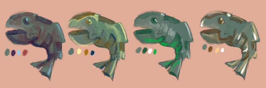
(An analysis of this that you don't have to read if you don't feel like it: I think the second one on the left looks the most interesting because it has the most varied color scheme. The one on the far right has the most boring color scheme, mostly because its too consistant with the background color. However the bright highlights instead make it interesting because of the contrast. Despite the various colors, you can pretty much tell that these are all metallic fish.)
The most helpful thing I've ever learned was from a really awful book in which was an article about how to put on makeup. The book was really trying to be about color, but it was written terribly, and mostly talked about interior design and how to find pillows that matched your sofa. I don't even have a sofa! But the little part about makeup was actually kind of useful because it really taught me, first, how to color in faces, which used rules that applied to color in general and from it I made some guidelines so that I know why it looks bad if I think that it does. The following is what I learned.
First - every picture has a sort of color scheme. If your color scheme includes every color in the rainbow with the same degree of brightness, then the picture sort of averages out to be a muddy grey.
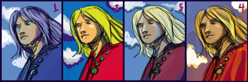
1. Everything has a color scheme. 2. Some colors schemes have too many contrasting colors and look awful and gaudy. 3. and 4. Even if the character is gaudy to begin with, it doesn't mean the picture can't look attractive. Color schemes can be changed without changing the inherent colors in order to better suit the picture.
Second, while people use many different color schemes, it seems that they usually focus around either cool colors or warm colors. Using cool colors doesn't necessarily mean that every color in an image is green, blue, and purple. Nor does a warm image mean that every color is of red, yellow, and orange. It's not these things, it is just a general feeling from the finished image. Do all those colors, when mixed together and seen from afar, create a bluish impression or an orangeish impression? If it's a bluish impression, then it does no good to color a character's skin a deep orange. It will clash and generally look awful. If it's an orangeish impression, then a sea foam green is going to look out of place and weird. What one needs to do is find other shades of the same color that will match the color scheme better.
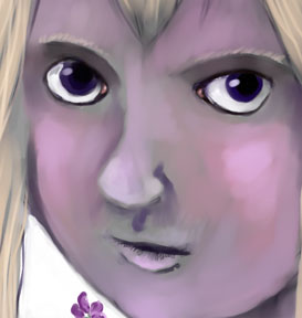
I can't give out every example of how to use this, so I'll just start with skin tones. A person's skin can take on so many different colors in different lights. I hate it when someone has a gorgeous moonlit scene going on, with the bluish white light of the moon, the greenish colors of the branches, the deep purpleish shadows.. And the a person's skin is rendered in some hideous orange, or, since it's dark, a raw brown color. Skin can be so many more colors than that.. For instance, this image ended up being very cool colored, so I did this girl's face by putting down a layer of grey and then carefully going over it in pink.
Making a color greyer, paler, and pinker often helps in turning oranges, browns, and reds into more matching colors for a bluish, greenish, or purplish picture.
In contrast, making a color greyer, redder, or browner often helps in turning blues, greens, and purples into more matching colors for an orangeish, yellowish, or reddish image. Changing blue shadows to purple can help, or purple shadows to brown...
Part three: Coloring Line art
Usually, people start coloring by filling in line art. There are a lot of things that really bother me about how people go about this so I'll list them all here. All the images are of things not to do.
First thing - Lines in line art represent shadows. When trying to color something with some semblance of realism, it doesn't work for there to be dark black lines in places of brightness.
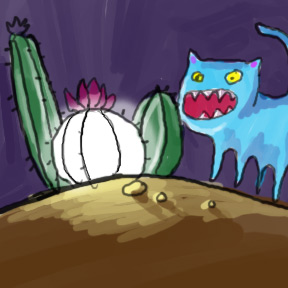
Second thing - Since lines represent shadows, it makes no sense that coloring should not go right to their edge, possibly getting darker as they near that black line...
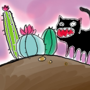
Third thing - And since lines represent shadow, the darkest part of an image should not be away from that line.
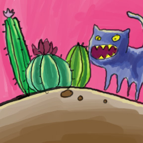
Fourth thing - A fuzzy method of highlighting makes everything look like plastic, nothing look real, gives everything the same texture, and looks like a crappy photoshop job.

Fifth thing - dodge and burn are not your friends.

Sixth thing - nor is darkening the color to make a shadow and lightening it to make a highlight.

Seventh thing - outlines do not always look good in black, especially if one is using a lot of pale colors.

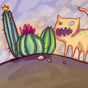
Doesn't this look much better?
That's all I have to say on color for the moment. If you're interested in anything else, don't hesitate to contact me.
BACK
Random Is God